
Go Responsive with ASP.NET MVC

Recent mobile web statistics indicate that a huge percentage of users of your web application are likely doing so from mobile devices. But are you providing the best possible user experience for all your users – especially ones on smartphones or tablets? In this article, we will explore some options to support mobile users of your web application built with ASP.NET MVC.
The Challenge
Although mobile devices present a huge opportunity for outreach and mobile browsers have definitely come of age, optimizing the user experience from a development standpoint is marred by some deep challenges. Just a few of the headaches include a dizzying variety of mobile device screen sizes, support for multiple input methods, mobile browser standards compliance and cellular data bandwidth considerations.
The good news is that if you are building web apps for modern browsers with the latest ASP.NET MVC stack, you already have several out-of-the-box options for you to optimize the user experience for mobile device users. There is, of course, no one-size-fits-all option; each web application needs to be evaluated for scope and business needs before defining the level of support for mobile devices. However, there are several architectural options for developers of web apps to support mobile browsers – let’s dive in.
Option 1: Do Nothing
Believe it or not, this is a viable option. You could simply create a regular desktop-oriented web application and rely on mobile browsers to render it acceptably. Modern mobile browsers do have decent support for HTML/CSS/JavaScript standards, but your users are likely to be subjected to unnecessary scrolling or zooming, thus hurting the user experience. While you can optimize for supporting touch, the sheer plethora of variance in mobile browser capabilities will work against you and the experience on older mobile devices will suffer further.
Even if you choose this lowest cost route of supporting mobile browsers, there is one trick no one should forget – simply read the viewport of the rendering browser on the device and adjust initial scaling for a somewhat better experience. This one line of code on individual page headers or on a master page does the trick of recognizing the size of the device viewport and rendering the whole web page to fit without initial scrolling:
@* Adjust the viewport width as per device width for mobile *@
<meta name=”viewport” content=”width=device-width, initial-scale=1.0” />
Solve the Problem Client-side
A really good way to cater the web user experience for mobile device users is solving the problem on the client – the mobile browser. With careful selective usage of Cascading Style Sheets (CSS), you can style appropriately for whatever browser is running the application. This set of techniques is what is commonly referred to as Responsive Web Design (RWD). While you can hand code CSS Media Queries to detect mobile browser capabilities and customize your web app, there are frameworks that can simplify much of this work for you. Let’s dig in to some of your options for going responsive when developing on the ASP.NET MVC stack.
Bootstrap
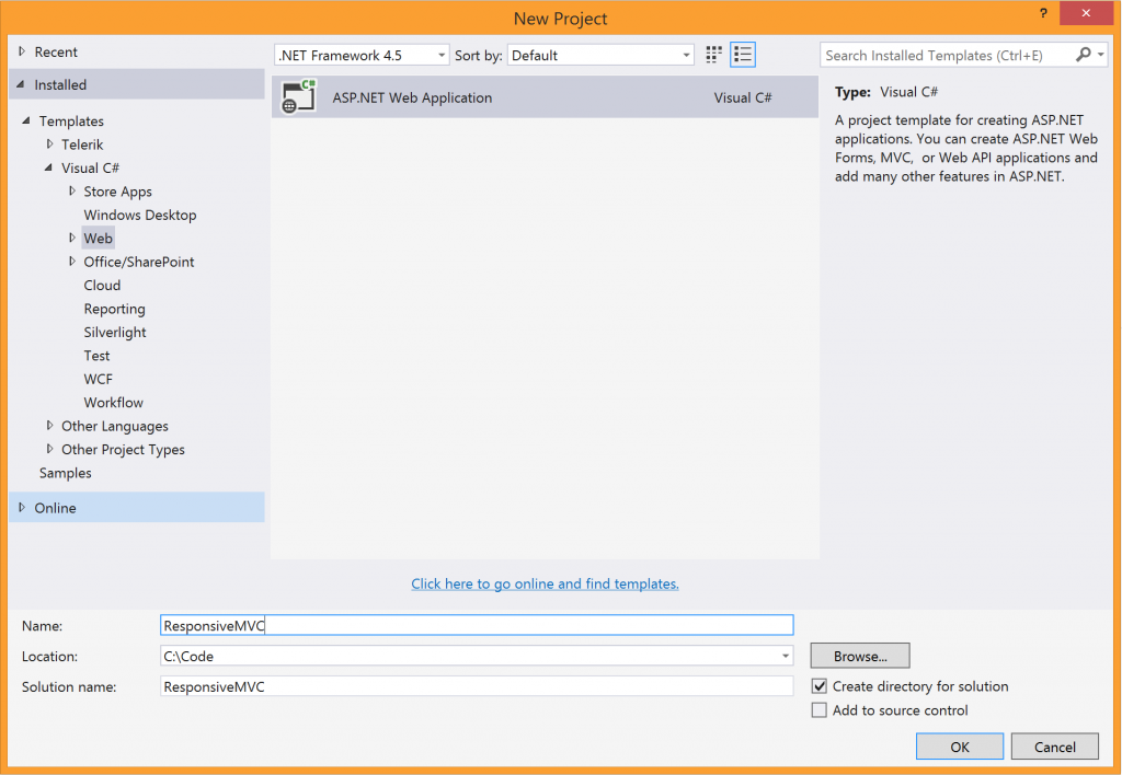
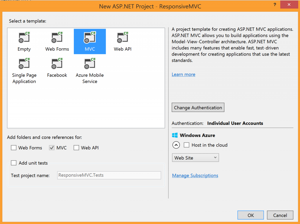
Started by two guys at Twitter, Mark Otto and Jacob Thornton, Bootstrap is undoubtedly one of the most popular front-end frameworks for developing responsive, mobile-first web apps. Booststrap offers a number of UI components and jQuery-based JavaScript plugins to create web apps that work seamlessly on any device. Using ASP.NET MVC 4 to build your web app? You can easily bring in Bootstrap's capabilities through a NuGet package. If you are using Visual Studio 2013 and ASP.NET MVC 5 to build your web app, Bootstrap is built-in and the default technique to go responsive. Let’s take a look as we start a new ASP.NET MVC web project in Visual Studio, as shown in the Visual Studio dialogues below:
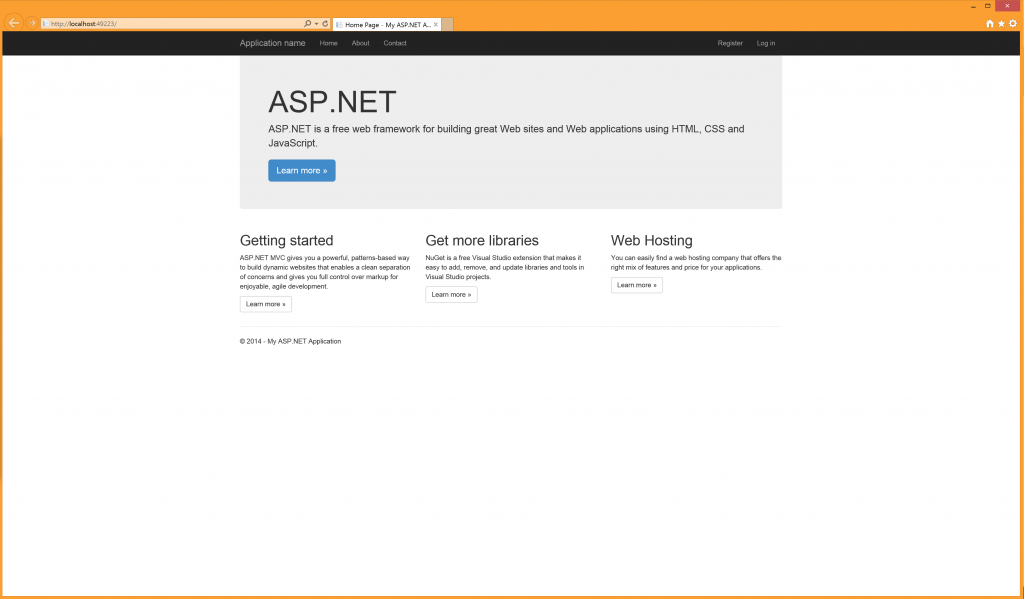
Let’s run our web application without making any changes, just to see what the boilerplate code does. You should have your web app running on localhost through your local IIS server. We can see the default ASP.NET web application running, as seen below. However, let’s now resize and shrink our browser window down to the size of a tablet or smartphone. Notice something? The content adjusts to the available width, becomes a single column as needed and menus move into mobile-friendly drawers, as seen below.
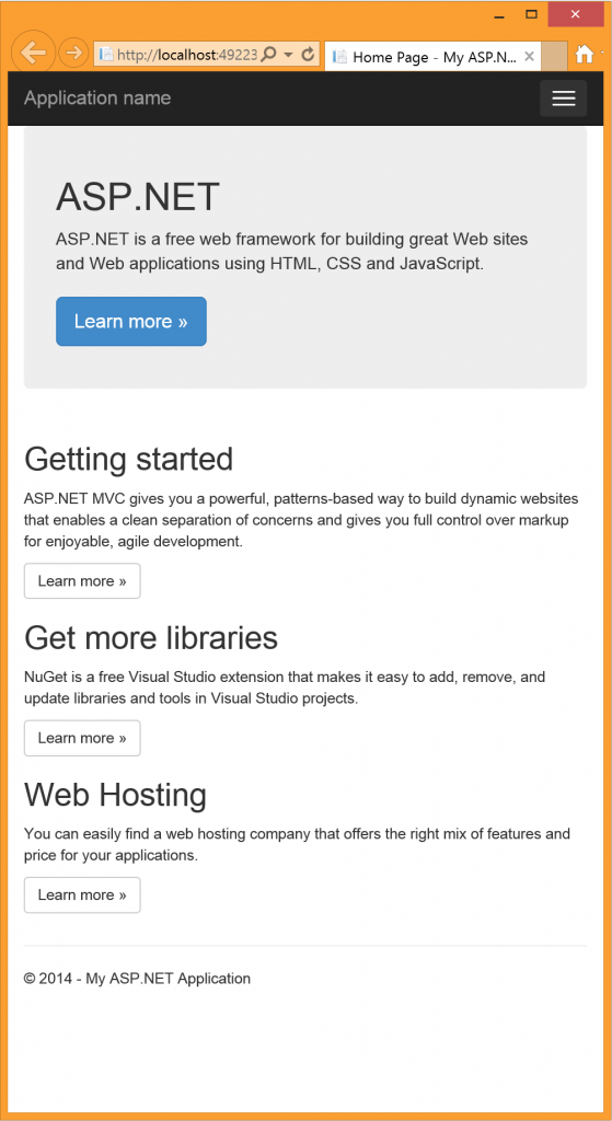
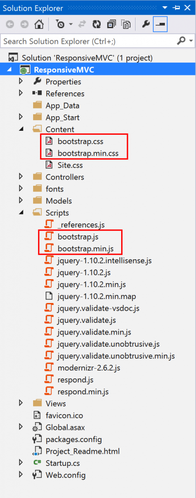
So, how is this happening? MVC 5 web projects in VS 2013 already includes Bootstrap 3 as the default technique of building responsive applications. Take a peek inside the "Content" and "Script" folders (as seen below) to see the files causing the responsive behavior. How cool is that out of the box?
Now, the default Bootstrap template used in VS 2013 web projects is called Jumbotron. It is a simple placeholder for informational or marketing sites. It is quite easy to go with the boilerplate template or start customizing from any of the other Bootstrap example templates – get the necessary CSS and JavaScript files from Bootstrap, include them in your project, alter BundleConfig.cs in the "App_Start" folder to push down the required files to the client and update _Layout.cshtml (the default view master template in MVC) to use the appropriate CSS classes.
Clean Up
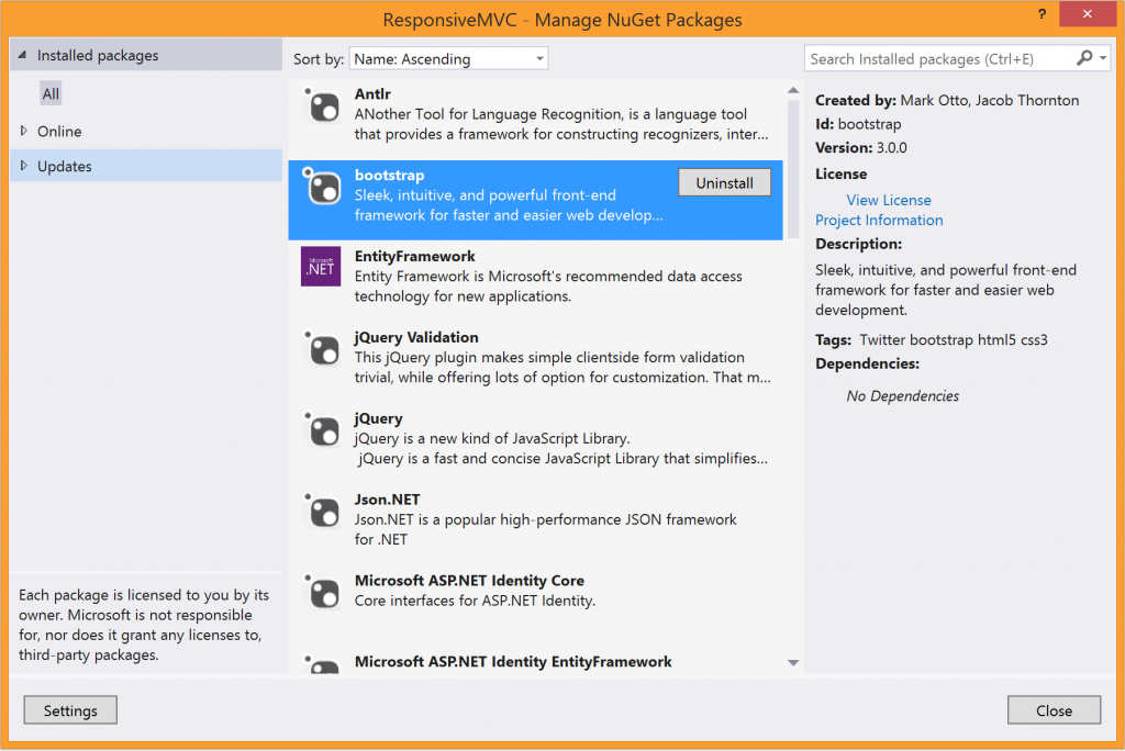
One thing you might wonder – what if you wanted to alter some responsive behavior and not use the default Bootstrap at all? That’s pretty easy to accomplish as well. VS 2013 web projects have a couple of hooks in place to use Bootstrap 3 as the default responsive framework. To remove them, uninstall the Bootstrap NuGet and delete the Bootstrap content lines of code from the BundleConfig.cs file, as seen below:

Foundation
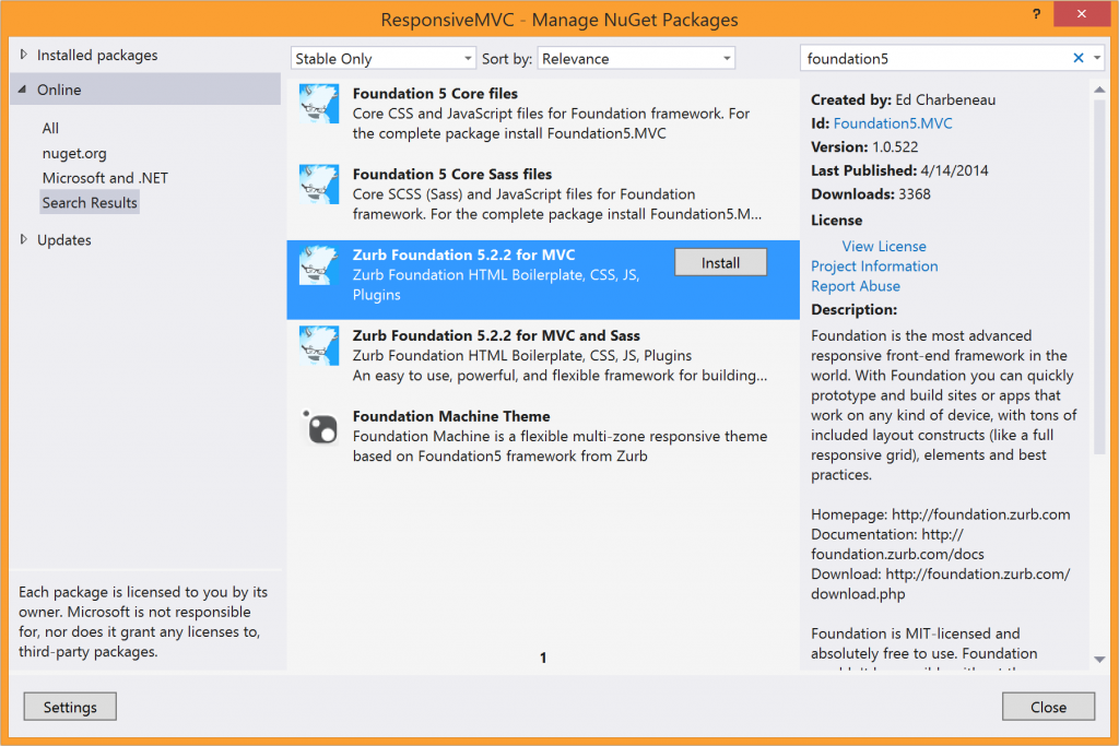
Started by the design team at Zurb, Foundation is another very popular front-end framework for responsive web applications. Foundation provides a flexible grid system, UI components and JavaScript plugins for making life easier as a web developer – all of which are documented in the kitchen sink. It is just as easy to incorporate Foundation 5 in your ASP.NET MVC applications, starting with MVC 4 and forward. After cleaning up our VS 2013 project from the default Bootstrap responsive framework, let us simply add Zurb Foundation into our project through the available NuGet package, as seen below:
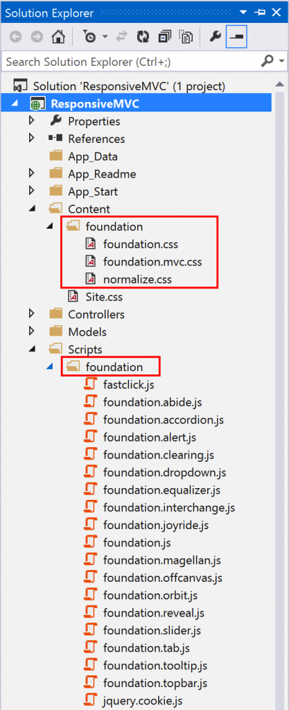
The addition of the Foundation NuGet package tweaks a few things in our VS project – first, you'll notice that the required CSS and JavaScript files are included in the project. You’ll also find that BundleConfig.cs has been altered to push down the required files to the client browser, both seen in screenshots below:

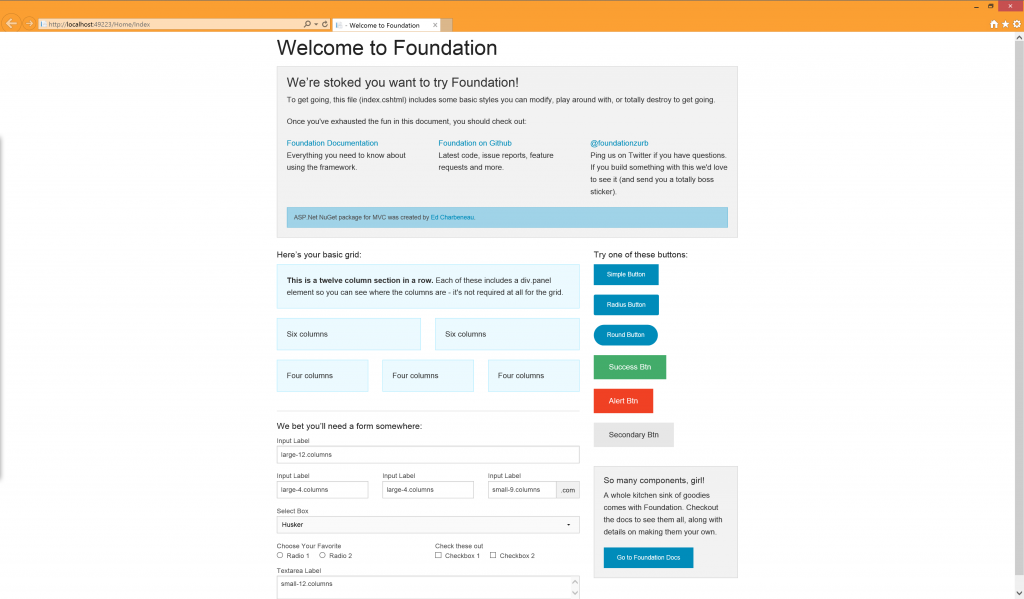
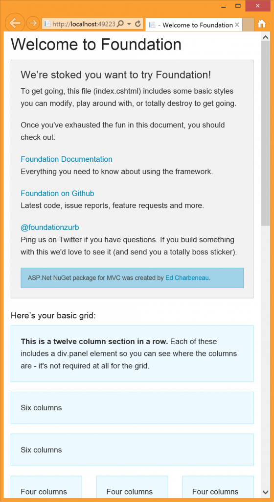
You’ll also notice that the Foundation NuGet changes a couple of layout pieces in _Layout.cshtml, the MVC master page, so that you have some boilerplate code that is already responsive. Let’s build our project and fire up our MVC web app. Sure enough, we see the Foundation template with all its columns in full width desktop mode, but the page contents and columns adjust themselves when the width of the viewport shrinks for a truly responsive user experience, as seen below:
Solve the Problem Server-side
We’ve now seen two of the most popular front-end responsive frameworks, Bootstrap and Foundation, work seamlessly with ASP.NET MVC web projects. These frameworks can do the heavy lifting for you and your web app to deliver a responsive user experience. Going responsive on the client side is definitely a great option for many applications, but it does have downsides. If you want to deliver a user experience on mobile that is completely different from the desktop counterpart, you may have a limitation on how much you can achieve with CSS media queries on client side. Also, client-side responsiveness may lead to inefficient bandwidth usage – you may be transmitting quite a bit of markup and styles to the client, with a only a subset of it being shown on the mobile device in question. So, as with many things in software engineering, the best solution for supporting mobile often is, "It depends."
If your web server knows the characteristics of the device accessing the web app, you have the opportunity to truly provide a user experience that is catered specifically for mobile devices. You can have conditional server side logic and emit lightweight markup that is suitable for mobile browsers. While this provides the maximum flexibility, solving this problem server side often takes the most effort and may lead to repetition of effort or code.
The major issue in going responsive on the server side is device capability detection – this is not trivial. Thankfully, there is a lot of help. It essentially boils down to sniffing the User-Agent HTTP header in the incoming request from a client and figuring out the browser capabilities. Here are some options for you:
- ASP.NET MVC has built-in browser detection support – simply look into the
Request.Browserobject in the HTTP pipeline. Some pertinent properties to look into areIsMobileDevice,MobileDeviceManufacturerMobileDeviceModel,ScreenPixelsWidthand others. - You can add the open source 51Degrees.mobi Foundation library to augment ASP.NET’s built-in browser detection. This
IHttpModuledirectly taps into the Wireless Universal Resource File (WURFL) project for much more accurate browser capability detection. - If you are using Telerik UI for ASP.NET to augment your generic MVC toolbox with performance optimized Ajax controls in developer-friendly tooling and professional skins, you can tap into Telerik’s RadDeviceDetection framework. This lets you know the exact screen dimensions of the client for you to cater content for optimized user experience.
Once you know that your client is a mobile device, a common trick in MVC web applications is to present a mobile-specific page. You can use the same Controllers as for the desktop version, but render Views with mobile-friendly Razor layouts. Simply swap out your master layout in _ViewStart.cshtml, like so:
@{
Layout = Request.Browser.IsMobileDevice ?
         "~/Views/Shared/_LayoutMobile.cshtml" : "~/Views/Shared/_Layout.cshtml";
}Conclusion
Overall, if you are building web apps on the ASP.NET MVC stack, you have plenty of options when it comes to supporting mobile browsers. You can go all out being responsive on the client side through easy integration with frameworks like Bootstrap or Foundation, or you could solve the problem server side with accurate device detection. With today’s tooling around web development, there is no excuse to not offer the best possible user experience on any device consuming the web application. Happy coding!

Sam Basu
Sam Basu is a technologist, author, speaker, Microsoft MVP, gadget-lover and Progress Developer Advocate for Telerik products. With a long developer background, he now spends much of his time advocating modern web/mobile/cloud development platforms on Microsoft/Telerik technology stacks. His spare times call for travel, fast cars, cricket and culinary adventures with the family. You can find him on the internet.
Related Posts
Comments
All articles
Topics
Latest Stories
in Your Inbox
Subscribe to be the first to get our expert-written articles and tutorials for developers!
All fields are required